Selfridges
Optimised the Selfridges digital experience to drive revenue and boost user satisfaction
Overview
Wunderman Thompson was brought into Selfridges with the core objectives of increasing revenue and improving NPS scores, ensuring the online shopping experience lived up to the iconic brand's reputation. As a UX Designer and Researcher, I played a pivotal role in driving these goals forward, contributing to a variety of projects that spanned the entire customer journey. This included:
Checkout redesign: Streamlined the purchase process to reduce friction and improve conversion rates.
Site-wide optimisation: Led a series of design sprints to refine and test key touchpoints across the digital experience.
Services and appointments optimisation: Developed a backlog of refinements to enhance the visibility of services and streamline the online booking journey to drive more traffic into stores.
These projects required a blend of design and research skills, as well as deep collaboration across teams to balance user needs with business goals. In the following sections, I’ll discuss these initiatives in more detail.
My role: Lead UX Designer / User Researcher
Agency: Wunderman Thompson
Team: Experience Director, Visual Designer, Project Manager, Business Analyst, Data Analyst, Technical Architect, Developers, Stakeholders/Client representatives, Selfridges UX Manager, UX Designer & Trade team
Project duration: 7 months
Location: Co-locating with the client between Selfridges’ offices behind Oxford Street, and Wunderman Thompson offices in Mornington Crescent, London
Deliverables: Workshop design and facilitation, user journeys, user flows wireframes, prototypes, UX audits, optimisation tests backlog, service refinements backlog, competitor benchmarking, user research (planning, facilitation & analysis)
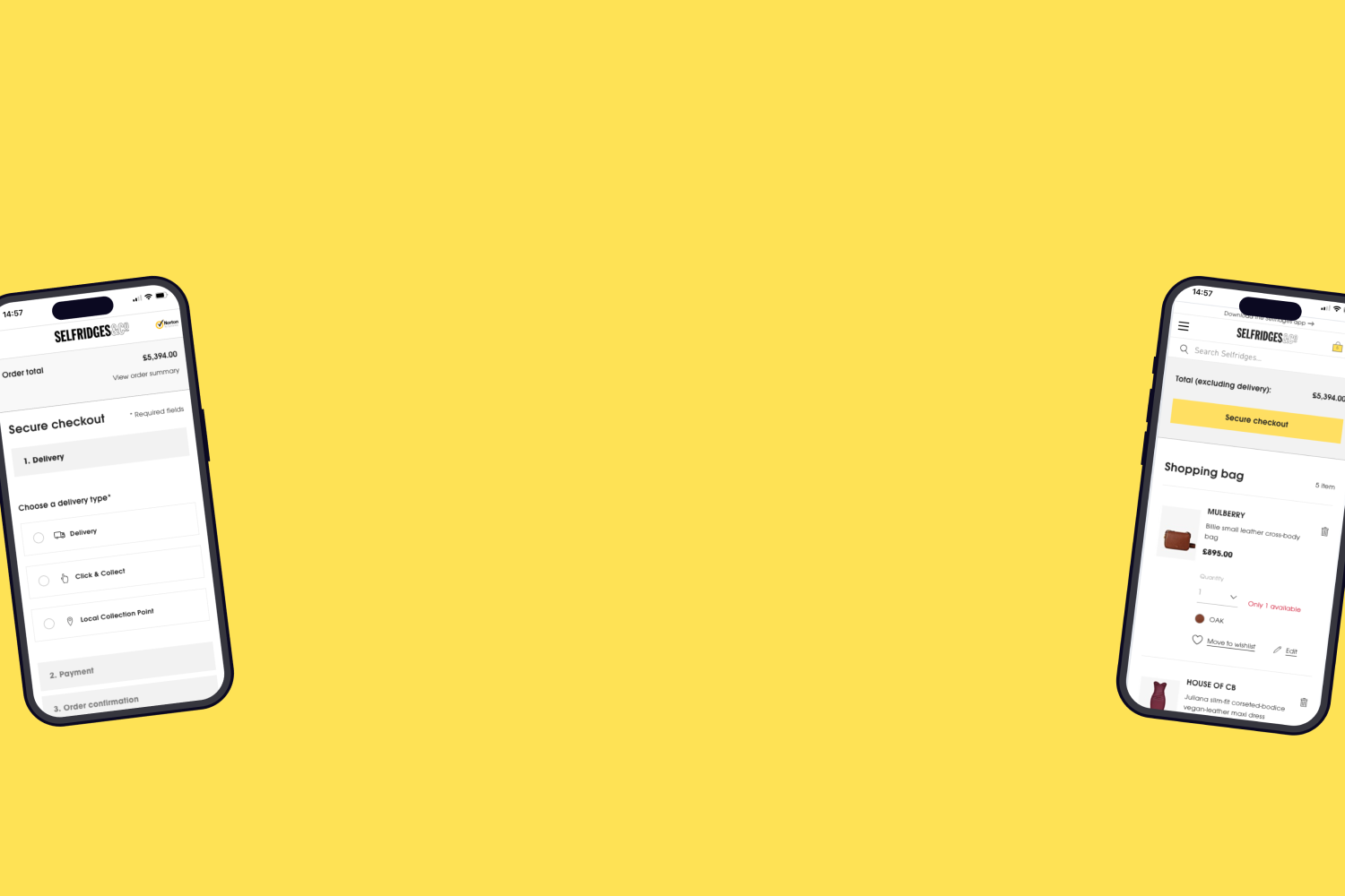
Checkout redesign
When I joined the project, the checkout redesign was already underway as part of a re-platforming initiative. My role was to review the existing user flows and planned updates to identify opportunities for optimisation. Upon review, I identified missed opportunities for improving the user journey.
To address this, I developed rapid prototypes to demonstrate potential enhancements that could create a more seamless and friction-free experience for customers. These prototypes helped steer the project toward a more user-centered redesign.
The team subsequently pivoted to the updated approach, and I collaborated with a visual designer and the Selfridges UX team to test, iterate, and refine the solution. The final design, which was successfully implemented, continues to provide a streamlined checkout experience for users today. See live site.
This is a section of a prototype I created in Axure for testing, incorporating some hi-fi elements transferred from the Visual Designer’s Sketch file using a plug-in.
Optimisation tests
We took a data-driven approach to optimisation, continuously refining and enhancing the user experience through iterative design and testing. The process was collaborative, involving UX designers, data analysts, visual designers, and developers, all working together to identify opportunities for improvement and validate solutions before implementation.
Our optimisation efforts focused on addressing user pain points, testing innovative ideas, and aligning design changes with business goals. We followed a structured process designed to deliver measurable and impactful results.
We began by conducting UX audits of key user journeys to establish the initial test backlog. Following this, we introduced a structured process for stakeholders to contribute their ideas and assumptions via a Google Form, ensuring a collaborative and consistent way of working.
UX approach
We worked in design sprints, and during sprint planning, we reviewed the prioritised backlog and agreed on the focus for the sprint. Data analysts provided supportive data and remained available to address any unanswered questions or further queries.
I collaborated closely with a UX designer from Selfridges, and we divided the backlog into specific focus areas while regularly checking in and sharing ideas as a team. We validated ideas in biweekly user research (UR) sessions. Once we had confidence in an approach, the visual designers created high-fidelity designs, which were passed to:
The dev team for implementation if the test required complex functionality.
The data analyst for simpler changes (e.g., text or image tweaks), which could be set up in the visual editor.
Example: Optimising Selfridges+ delivery service signposting on product pages
At the time, the Selfridges+ premium delivery service was signposted above the "Add to Bag" CTA, but the link was small and led users to another page for more information. This approach disrupted the user journey, taking them away from the product page and missed an opportunity to encourage them to add the service to their shopping bag.
Proposed Concept
To address this issue, we developed and tested a new design concept:
Side drawer: Clicking the link opened a side drawer with clear, condensed information about Selfridges+ and CTAs to "Add to Bag."
Toast confirmation: After clicking "Add to Bag," a toast confirmation displayed
Option to remove: Once added the user could easily remove Selfridge’s + if they changed their mind.
Uninterrupted flow: The new design kept users on the product page, avoiding the disruption of navigating away.
Axure prototype of the new concept we tested with the side drawer for Selfridges + information and CTAs to ‘Add to bag’
User Testing Insights
Before setting up the optimisation test, we validated the concept with users in face to face lab sessions:
Majority of users found the information in the side drawer useful for understanding Selfridges+.
They also liked that they could add Selfridges+ directly from the side drawer.
User quotes:
“It’s good to get information about the subscription, extremely good. It’s a bargain—£10 a year, you can’t go wrong. Even global for £40 is really good.”
“The information is really clear. I can see the benefit of Selfridges+ straight away.”
Results
This concept was implemented as an optimisation test, and while the exact results cannot be disclosed here, the test demonstrated a measurable uplift in the number of users who added Selfridges+ to their shopping bag compared to the previous flow where users were redirected to a separate page.
This was just one example of the many types of tests we conducted. Some other examples were:
Adding brands to the main navigation: Examined the hypothesis that increasing the prominence of brands would boost Click-Through Rates (CTR).

Optimisation on product pages:
Improved delivery information on product pages to give better access and clarity to reduce friction in the purchasing process.
Improved colour selection visibility & refined size guide information to support confident purchasing decisions.
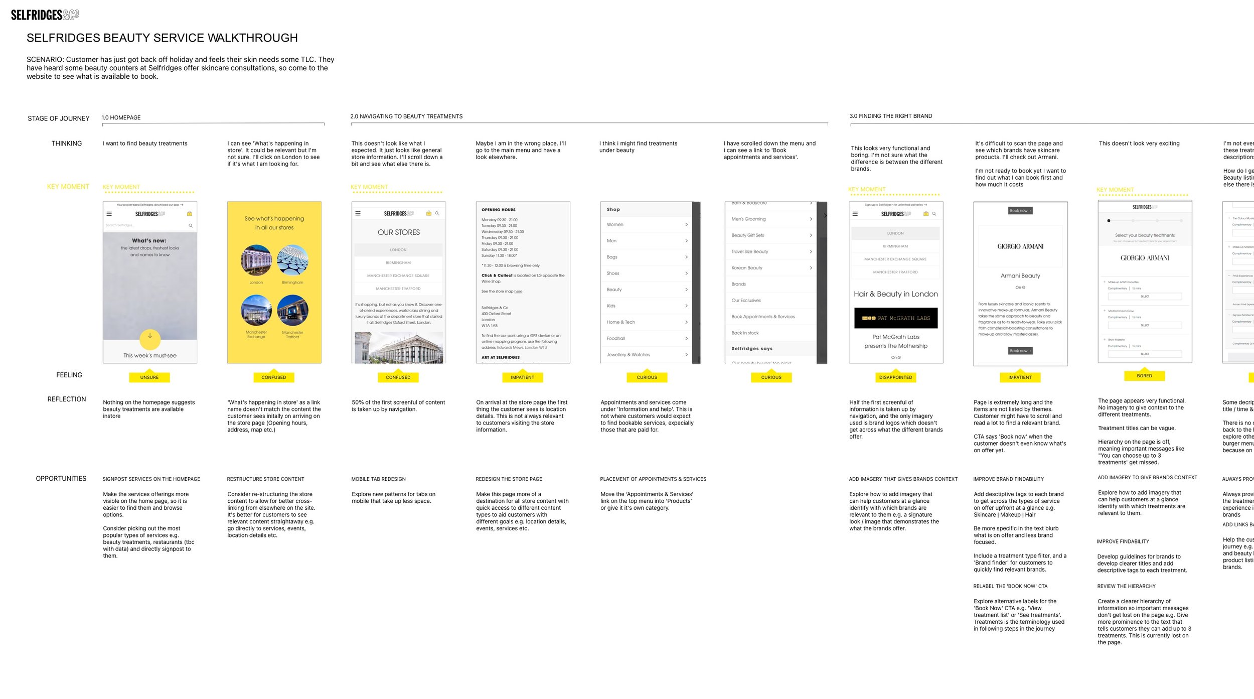
Driving traffic to in-store services at Selfridges
Selfridges needed to better promote their in-store services both online and in-store to increase traffic and bookings. The challenge was to streamline the online booking journey, making it easier for customers to book appointments while ensuring it’s clear that services are bookable throughout the customer journey.
Services ranged from beauty treatments, lingerie and bra fittings, and personal stylists/shoppers to optician appointments. The UX Manager at Selfridges brought me on board to lead this initiative from a UX perspective.
My role & contributions
UX audit: Conducted a UX audit of the various service types, the online booking journeys, and the in-store experiences. This included identifying pain points and opportunities for improvement across the end-to-end customer journey.
Service walkthroughs: Created detailed walkthroughs of specific services (e.g., beauty treatments), analysing the customer journey from the perspective of a typical user scenario. These walkthroughs uncovered both online and in-store friction points and opportunities for enhancement.
Lab-based user testing: Led user testing sessions to observe how customers interacted with the online services. Sessions began with an exploratory phase, allowing users to freely navigate and express their thoughts, before transitioning to task-based scenarios to evaluate specific interactions and usability.
Backlog creation: Compiled a detailed backlog of recommendations, supported by insights and evidence gathered from testing and audits. Each recommendation was categorised as a quick win, an area requiring further exploration, or an enhancement constrained by third-party limitations of the booking service.
Facilitation and prioritisation: Facilitated workshops with the services team and the UX Manager to review and prioritise the backlog. Together, we identified immediate opportunities, areas needing further design exploration, and changes requiring collaboration with third-party providers.
Prototyping solutions: Explored agreed focus areas by creating mock-ups to demonstrate potential improvements to the online experience. These designs were used to put forward proposals for changes to the wider business.
Project handover
This was my final project at Selfridges, and before leaving, I handed over the backlog and supporting materials to the team to ensure continuity. My work laid the foundation for future improvements, enabling the team to continue building on the insights and designs I developed.